
Data Storytelling: Assess Your Data
Written by Sam Camarena of California State University, Office of the Chancellor and Karen Latora of Advance Data Strategy
Successful data storytelling is not about creating the most complex visualization; it’s about delivering the right message to the right audience, in a way that drives understanding and action.
In our first article, we focused on understanding the audience for your data story. Here, we focus on preparing an effective message. Once you know who you’re trying to inform or influence, the next step is determining whether you have the data needed to tell that story effectively. This means taking an inventory of your institution’s available data, identifying gaps, and developing a strategy to fill them.
Many data projects start with an important question. Common questions in higher education advancement include:
- Are we retaining enough first-time donors?
- Is our campaign pipeline healthy?
- Are our alumni engagement efforts leading to philanthropic support?
- Which programs are creating the greatest impact?
Answering these requires understanding what data you have, what data you need, and where gaps may exist. The good news: effective data storytelling does not require perfect data. You can get started by assessing what’s available and being intentional about how you use it.
Start With the Question, Not the Data
Some organizations begin by opening a dashboard or running a report and asking, “What can we learn from this?” A more effective approach is to start with the challenge or decision you are trying to support. I recommend starting with a simpler question: What problem are we trying to solve?
Before looking at metrics, reports, or visualizations, clarify:
- What decision needs to be made?
- What question are we trying to answer?
- What would success look like?
These questions help identify the information that actually matters. One of the biggest mistakes I see is teams starting with the reports they already have instead of the decision they need to make. A dashboard can tell you what is happening, but it can’t tell you whether you’re measuring the right things in the first place.
For example, if your institution is concerned about declining donor retention, you may need data about giving history, donor demographics, engagement activity, stewardship touchpoints, and communication preferences. If your goal is campaign readiness, you may need information about prospect capacity, portfolio coverage, proposal activity, and historical fundraising performance.
The question determines the data, not the other way around.
Inventory What You Already Have
Once the challenge is defined, take stock of what information is readily available. Many advancement teams possess more useful data than they realize.
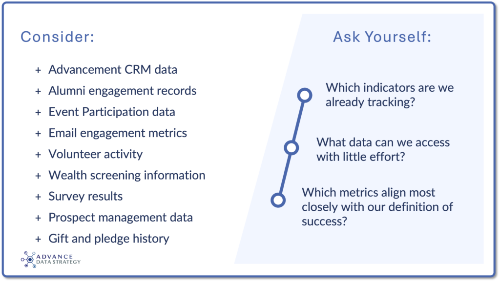
This exercise often reveals that some pieces of the story already exist. It is then important to identify what is missing–and what helps answer the question you’re trying to solve. However, the challenge usually isn’t a lack of information; it’s identifying which pieces of information actually help answer the question you’re trying to solve.
Conduct a Gap Analysis
A simple but powerful question can guide this process: What story can’t we tell with the data we currently have?
For example:
- A university may know that alumni attended a career networking event, but not whether those connections led to mentorship relationships.
- A fundraising team may know donor retention rates have declined, but lack information about why donors stopped giving.
- An advancement division may know event attendance increased, but have little understanding of whether attendees became more engaged afterwards.
These gaps matter because they limit the conclusions we can confidently draw.
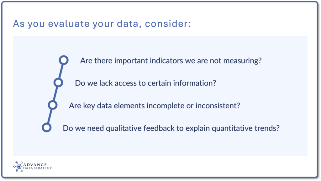
Sometimes the missing piece is a conversation, a survey, an interview, or a focus group that helps explain the numbers. A gap analysis helps with understanding the limits of what your data can currently tell you and deciding whether those gaps matter for the decision at hand.
One of the most important principles of effective data storytelling is trust. Before investing time in visualizations or presentations, ask whether your data is ready to support the story you want to tell.
Consider:
- Are definitions consistent across teams?
- Do we understand how metrics are calculated?
- Are exclusions documented?
- Is the data current enough to support decisions?
- Have we identified significant gaps or limitations?
Establish realistic expectations and be transparent about what the data can and cannot support. The data does not need to be perfect: trust is built when stakeholders understand both the strengths and limitations of the information being presented.
Trust is often more important than sophistication. I’d rather present a simple analysis that everyone understands and believes than a complex model that leaves stakeholders questioning the results.
Closing the Gaps
After identifying missing information, the next step is to decide what to do about it. Not every gap requires a major investment or new technology. Some solutions are surprisingly simple:
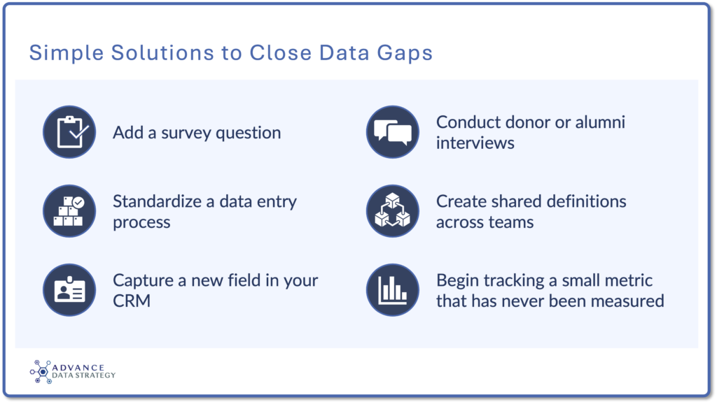
Other gaps may require larger conversations about staffing, reporting structures, or technology investments. The key is prioritization: focus first on the data that will most directly help your audience make better decisions. Not every missing data point deserves equal attention.
Remember the Human Story
One of the most common mistakes in advancement analytics is assuming that more data automatically leads to better stories. It rarely does. The strongest stories combine quantitative and qualitative information:
- A retention report becomes more powerful when paired with donor feedback.
- A dashboard becomes more meaningful when accompanied by examples from students, alumni, or volunteers.
- A fundraising trend becomes more actionable when stakeholders understand the experiences driving the numbers.
Data helps us understand what is happening. Stories help us understand why it matters. Both are essential.
As Karen Latora notes, “Working in advancement for many years, I’ve seen that data becomes far more meaningful when paired with real life feedback, stories, or scenarios. Metrics may tell us what changed, but conversations with students, alumni, and donors often reveal why those changes matter. This helps us share a good picture, a full story.”
Join us next as Karen and I continue to talk about the elements of an effective data story and how to transform analysis into a narrative that drives understanding, engagement, and action.

Sam Camarena
Manager, Advancement Academy
California State University, Office of the Chancellor

Karen Latora
Marketing Operations Director
Advance Data Strategy